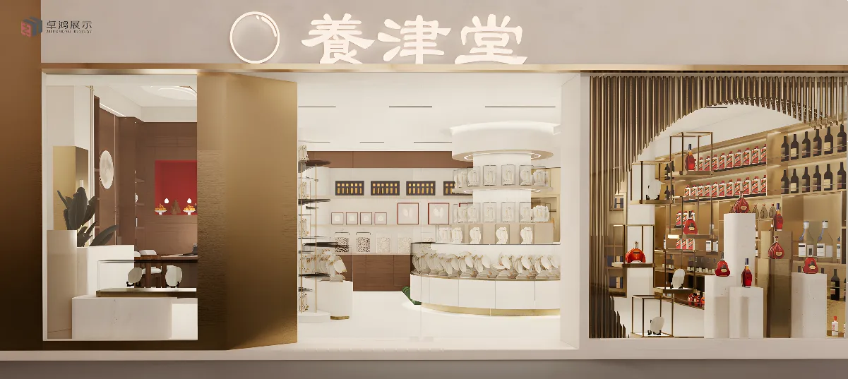
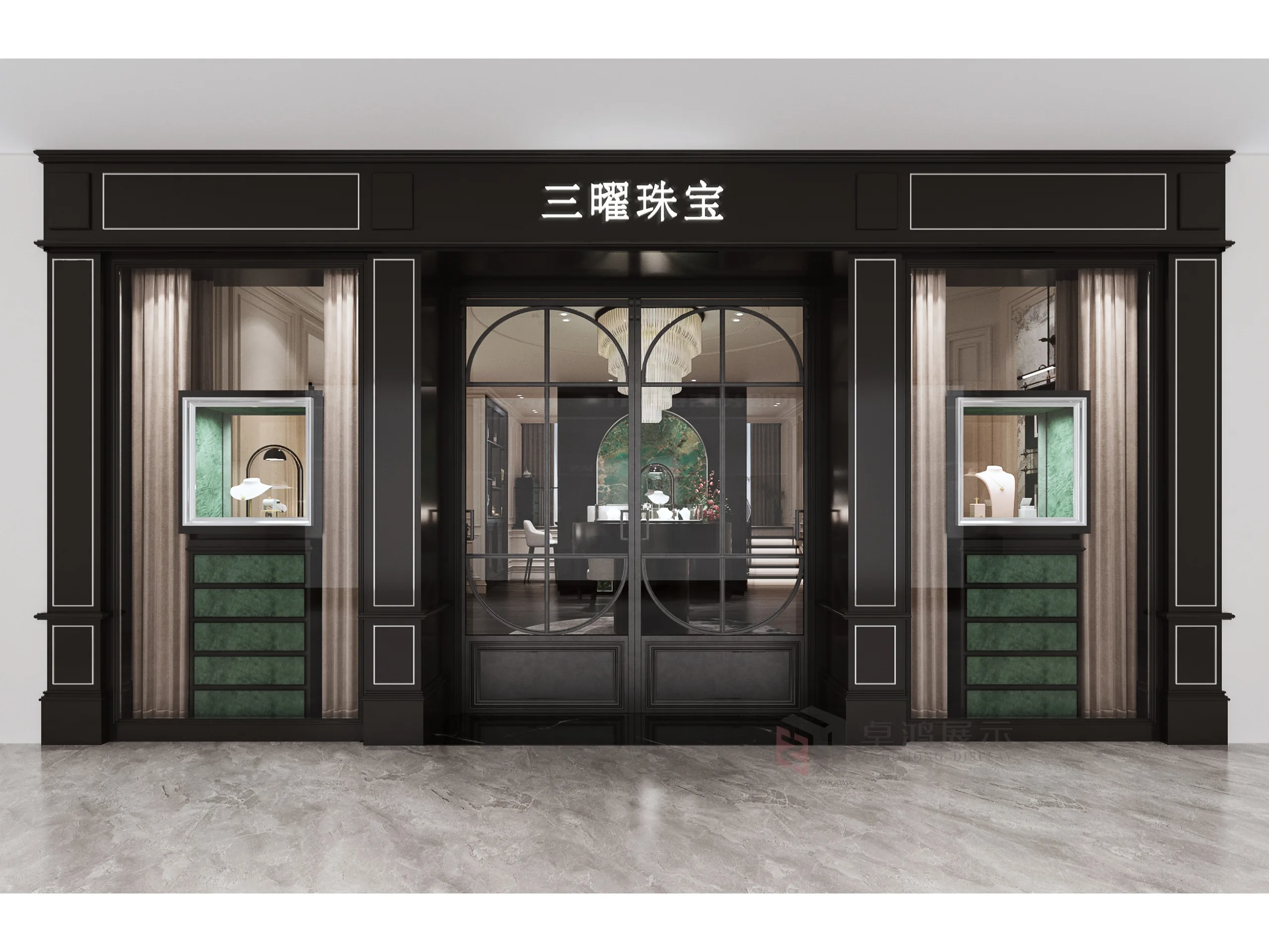
“Yangjin Tang” presents a store design that artfully fuses traditional Chinese aesthetics with modern retail sensibilities. The facade, rendered in soft, neutral tones, features the store’s name in elegant Chinese calligraphy, paired with a minimalist circular emblem—inviting and sophisticated, setting a refined tone.
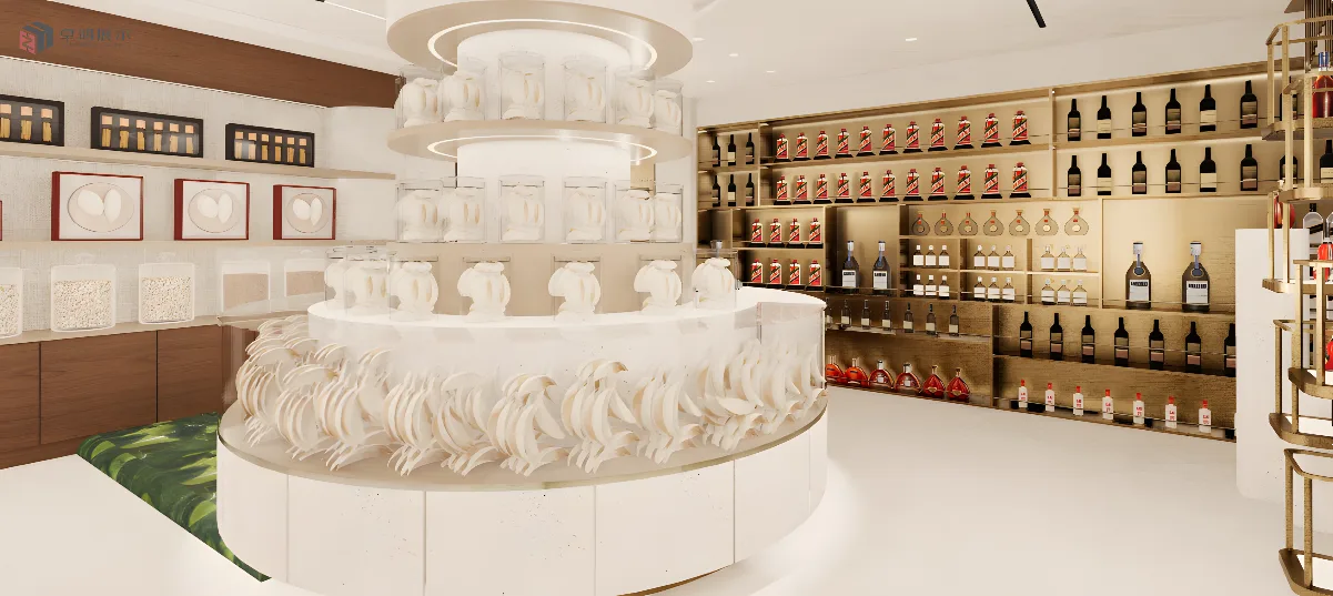
Large glass windows offer clear visibility into the interior, where a harmonious palette of warm wood, creamy whites, and subtle red accents unfolds. The layout is both functional and visually appealing: on one side, sleek shelving showcases premium bottles, their polished surfaces and strategic lighting emphasizing exclusivity. On the other, a curated display of health - tonic products—from neatly arranged packages to artisanal jars—suggests a focus on quality and tradition.
A central, circular display unit acts as a focal point, drawing the eye with its symmetrical arrangement of goods and soft, ambient lighting. Beyond, wooden cabinetry and framed decorative elements (like calligraphy or art prints) infuse cultural depth, while touches of gold trim add a hint of luxury. The space balances openness and intimacy—customers can browse freely, yet areas like the secluded wooden nook with red accents offer a private, inviting feel.
Every detail, from the material choices to the product presentation, reinforces a brand identity rooted in heritage and quality. It’s a space that doesn’t just sell health tonics but immerses visitors in a curated experience, blending the best of tradition and contemporary design to appeal to discerning shoppers.